Exclusive Guide · $500 Value · Now Free
The Accountants Guide to Rank in AI Search
- 10 Proven Strategie to Rank on ChatGPT & AI Platforms

Are these items already part of your accounting firm’s website design?
If not, they could be the reason that your website isn’t generating any new leads
We’re playing with AI. Try listening to our AI podcast of this blog post or watch the video summary below.

Providing expert marketing insights for accountants, bookkeepers and tax professionals.
Whether you’re planning on designing your own site or hiring an accounting website design agency, like MITCO Digital, these are some of the key things you’re going to want to get right. Ranging from a modern design to the key elements on a page, let’s look at what you should get right and what you should steer clear of.
These are the 10 Dos & Don’ts we’ll cover:

Avoid wasting your time and money with websites that don’t work. We work exclusively with accounting and bookkeeping firms. That means you get a website that not only looks great, but one that also generates a positive return for you!
The first thing to get right is to put a plan together for your accounting website. Spend time sharpening the ax before swinging aimlessly.
Ask yourself a few questions, like ‘What’s the purpose of my site?’ ‘How does it tie into my marketing strategy?’
Are you just adding new pages to your site ad hoc or have you carefully planned out your content in a logical way. How can the content that you’re creating for your website be used on other marketing channels like email or social media?
At MITCO Digital we follow a very clear formula for success with our clients, fixing up their existing website content (or starting from scratch) and adding around 60 new content pieces each year in order to build their online credibility and generate leads. All of that content ties together with all the other work we’re doing to provide one unified strategy.
What’s the point in putting together an amazing accounting website design if no-one is ever going to see it?
Search engine optimization is what brings your new accounting website to life. When it’s done well it ensures that your CPA firm’s site is seen in search results, generates traffic and ultimately new clients. SEO is arguably more important that design, especially in the first few moths. If your SEO isn’t in place then Google may not index or even show your website in search results. The first few months of your new website are vital.
Some of the key SEO features to get right in your accounting website design include:
Email us if you’d like to know more about the SEO results we’ve achieved with our clients.
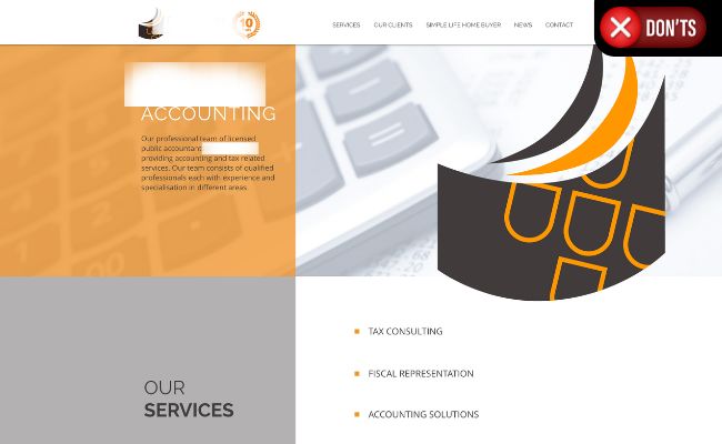

Ever met someone who just talked about themself the whole time and didn’t show any interest in you?
Most accounting firm websites tend to do this. They cover things like, ‘This is who we are and these are the services we offer.’ This generic content doesn’t set you apart from the thousands of other CPA firm websites that do the same thing.
Spend some time digging into your ideal client’s world. Understand their goals, aspirations, and pains. Get to know the financial aspects of running their business that are keeping them up at night. That immediately gives you the language to write content that connects with your audience. It will help drive action on your site, like getting people to fill in a form or call you.
Have you ever been to a website and felt like the copy was speaking directly to you. That’s what the best accounting websites get right.
This is similar to the point above but very important to mention. Many accounting website design companies can give you a great, modern design, but they lack knowledge of the industry. The result is that you get generic copywriting on your site.
A lot of CPA firm sites have some variation of this heading: ‘Let us handle your accounting so you can focus on your business.’
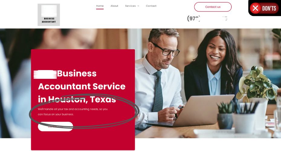
Have you seen this before? Maybe on your own site?…
Get creative with your headings and language to:
Understand your value proposition and how to present that in a way that will connect with your audience.

Download our 1 Page marketing checklist for accountants and bookkeepers.
We give you 24, easy-to-action marketing tips to help you get new clients online.
The checklist covers your website, content, ads and lead generation.
Lots of text is good for blogs but not for the rest of your CPA site, like service pages, home pages, landing pages, etc. The best accounting website designs use minimal text with the option to expand headings if readers want to see more content.
Using tools like HotJar, we’ve seen time and time again that visitors simply don’t read long blocks of texts on service pages. They’re looking for key information that will help them make a decision. They’re scrolling quickly through the page. Make sure your accounting website design has that information and it’s easy to digest. Big blocks of text don’t help.
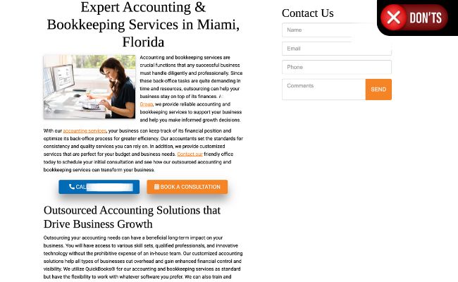
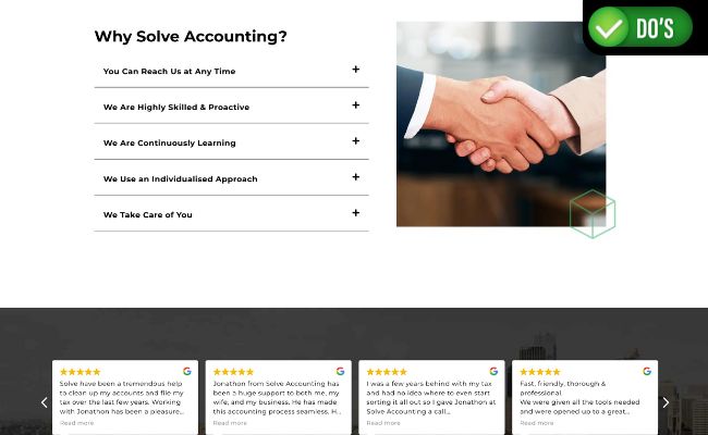
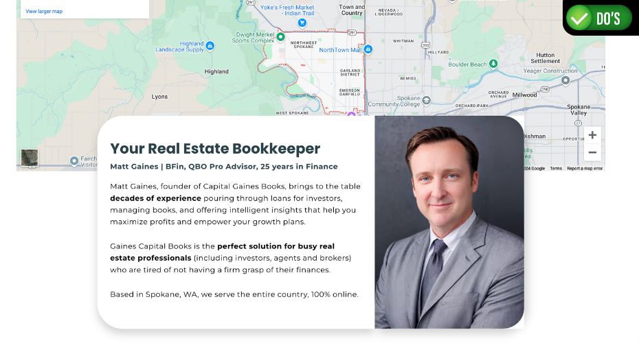
As an accountant you’re dealing with people’s finances and businesses. We need them to like you and trust you. The best accounting website designs will avoid stock imagery. They use real imagery and videos to build know-like-trust.
Some design elements that you could include:
People are rightfully slow to trust online content so having real images proves to prospects that you do in fact exist and are a legitimate accounting firm with real clients.
Social proof is a marketing strategy that references other people talking about your firm, to build your credibility. Similar to the point above, we need to establish credibility with visitors to your website, and often you have very limited time to do that.
Some ways that good accounting firm website design can get this right is by including things like:
You can also use elements like association memberships, badges and qualifications to add social proof to your website design and help establish credibility.
Things like a QuickBooks Pro Advisor badge or Xero Gold Partner icon can help show that not only are you accredited but that you’re familiar with modern cloud accounting software.

Ever been to a website where the buttons didn’t work, you clicked to contact them but nothing happened, the menu was difficult to use, or you couldn’t find the information you were looking for?
The best accounting website design puts user experience first. Your site should be easy to navigate, the menu should work, obvious content (like pricing and services) should be easy to find, and most importantly, it should be really easy to get in touch with you.
Sure, you want your website to stand out, but sometimes a site can be over designed making it difficult to use and understand.
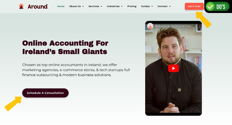
Strategically placed CTAs are essential in guiding visitors toward desired actions. You want it to be easy for them to schedule a consultation or click to call you.
Good website design for accountants makes it easy for clients to take the next step in their journey.
Your CTAs should be clear and compelling, using action-oriented language, like ‘Text Us Now.’ You can do things like use bright colors or animations on buttons to draw attention to the action you want people to take.
Here’s a few things that we do on all the accounting websites we design:
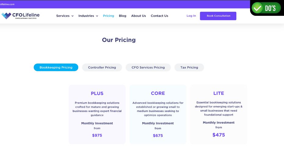
That’s a question we’re asked a lot. Our strategy is this. Prospects are looking for information online to make an informed decision. It’s very easy for them to open up 5 or 6 browser tabs and compare their options.
If your accounting website design doesn’t include a package or pricing page, then prospects can’t access that information easily, and will simply navigate elsewhere. There’s no reason to be committed to your firm so early on in the journey.
Your accounting firm’s website design should lay these packages out clearly in an easy to read and understandable format that works across all devices, especially mobile.
When it comes to pricing, we suggest displaying prices because it deters time wasters. Any leads that you do get will then be aware of your pricing and therefore be better qualified leads.
If you don’t want to show pricing, you could always use the strategy of saying, ‘pricing from $500/m.’ This helps set expectations and again eliminates anyone who can’t afford your services.
A modern accounting website design should be clean, logical, easy to navigate and easy to use. The language should be focused on the value proposition and how you help clients rather than just talking through what you do. Good SEO will make sure that your new website is seen online and strong, obvious CTAs will help turn those visitors into new leads for your accounting firm.
Speak to the team at MITCO Digital today about a modern accounting website design for your firm.

We exist to help accountants grow their businesses and annual revenue, by leveraging the real power of digital marketing.
Why would you waste money and time on strategies that don’t work and agencies that don’t understand your industry?
We know accounting. We understand your prospects. Most importantly, we know what works for accountants.
Contact us to discuss how we can help you grow your accounting firm.
